The WORST Signatures I’ve Ever Seen, Don’t Let Yours be One
by Heidi Springstube
Let me start by telling you that we are in a business that deals with, creates, and turns around email signatures on a daily basis….so we have the experience for guidance. I work in our Design Center where I customize everything! I take your signature line for your company and the brand you have worked so hard to convey and work to reflect your hard work into your email. Essentially, I live, sleep and breathe eStationery signatures. With that…

The Past
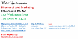
I have seen some UGLY signatures. You know the type and I am sure you have seen them too. The emails that come where there are so many text links on the bottom you are reaching for your anxiety meds. The ones that are filled with overwhelming underlines, no photo, mix and matched fonts and some bolding and italicized stuff. The company name and sender gets lost in the mush at the bottom of the email and you forget who even sent it to you. You waste time physically sifting through the mess that is in front of you for something as simple as a phone number. Even better yet are the ones that have a bunch of live links that you click on and they take you to an error page! That is NOT how a signature is supposed to look! I am truly not trying to insult anyone, but if you can find a solution that makes your email messages look nice, why wouldn’t you do something about it? Introduce yourselves to customers in a way that makes them think, damn, I need something like THIS and need to work with THIS person!
The Present
We at Brand My Message make a GREAT product called Brand My Email. It is currently used in Microsoft Outlook with web based images or computer based images hosted on a per computer basis. Expanding is our goal, and tackling all sorts of email platforms is in our near future. We make fully customized emails for each company we work with. Whether you are a small company or a big corporation, we work to ensure we meet all of your compliancy needs.
We ensure YOUR brand is carried down from your company highlighting your essentialinformation in a beautiful way. Your email will not look cluttered or chaotic. Customers give us GREAT feedback on a daily basis telling us how awesome our products are and how they have personally helped them get compliments for their company and thus increased business. Our emails are well polished and will put a smile on your face knowing you are representing your company in the way that you should. In the end, it is PROVEN that our eStationery helps you get the sale as it puts your information at the fingertips of your clients, making it easy for them to see who you are and what you do.
Your Future
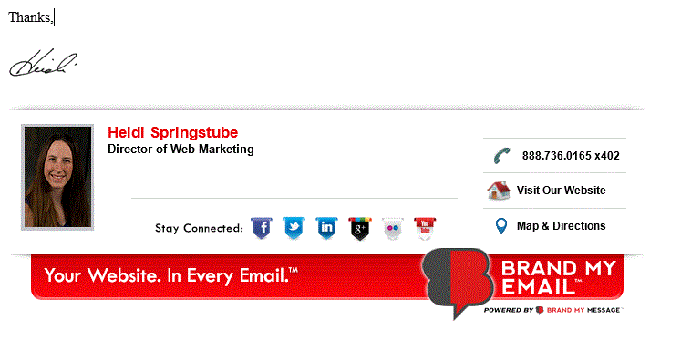
Below is an example of one of our eRepliers. It is not a functioning one, but a photo of one to show you what one can look like. This is what would show up when you want to reply or forward an email. We have a different looking one for a new message that is sent called an eLetterhead.
Give us a call for more details and to get started branding today!
